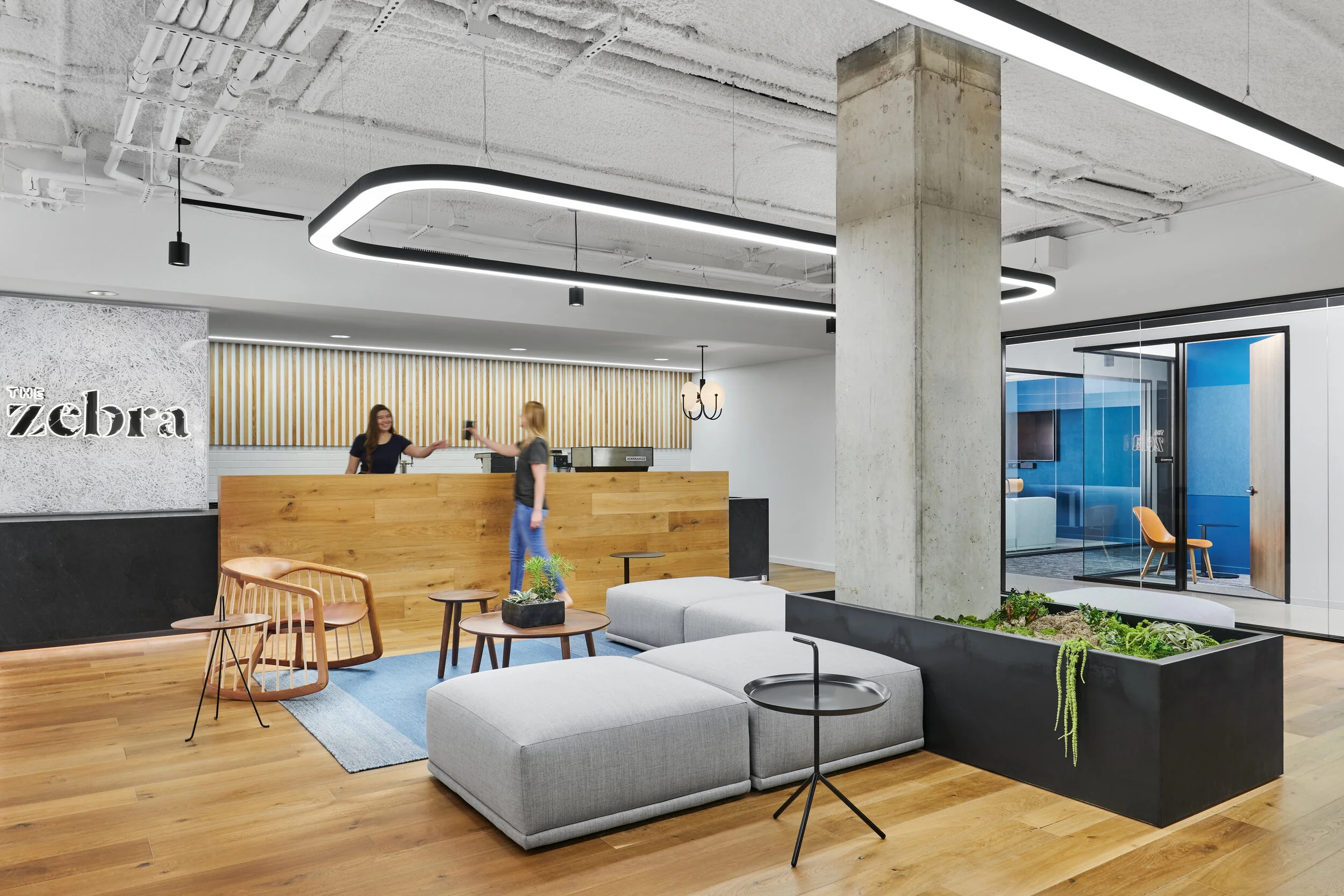
With any workplace interior project these days, a key establishing shot in a set of images is one of the lobby/reception area, a space that often sets the tone for the entire project design. In these shots, it’s important to give a sense of what it feels like to enter a space and the relationship it has with the connecting workplace areas beyond. The video below shows a walkthrough of the post-production for this establishing shot of The Zebra offices in East Austin designed by IA Interior Architects. The Zebra is an insurance comparison service, whose mission “Insurance in Black and White” can be seen clearly throughout the projects design and within this entry area. To see how this design language continues into further spaces, check out our previous video on controlling reflections in glass (some techniques which are also illustrated in the image being discussed in this post) here and on IA’s website here. The team at IA always bring really great energy to a shoot as the frames created to bring this shot together show.
As with many spaces like this, our process begins with a bracket of ambient frames to capture the space as the camera naturally sees it, and then we create a number of shots using flash in order to clean up the lighting, color and reflections. This video picks up after the initial RAW conversion done in Capture One as we move into Photoshop where we blend these images together to begin getting to the final result - a clean, descriptive photograph that shows the space and it’s design elements as well as how people interact and exist within.
The final image of the reception area for The Zebra in East Austin designed by IA Interior Architects.

