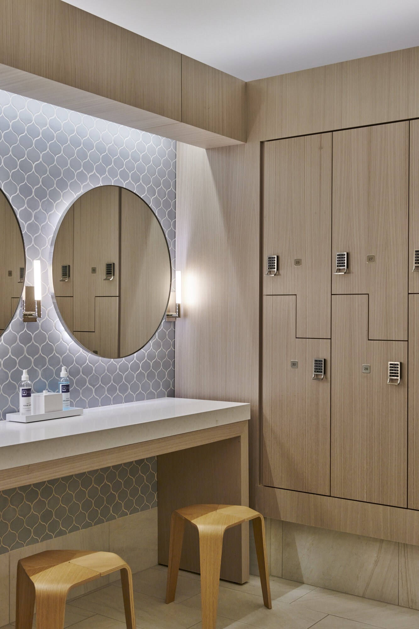
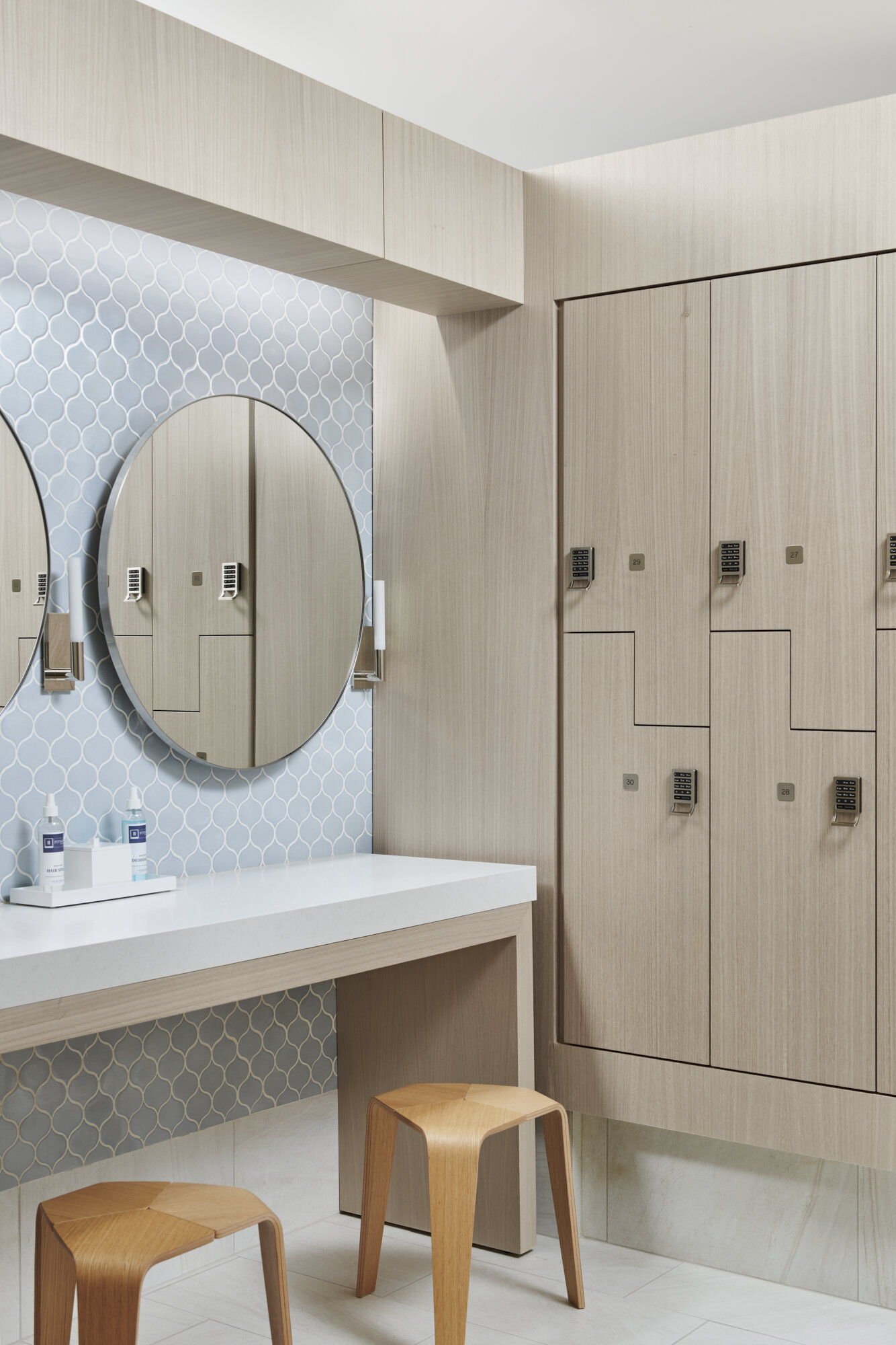
In architectural and interior photography, the debate between shooting using only available light versus supplementing the lighting with strobes has been around for a long time. In my latest video, I discuss the thinking behind choosing to use flash to help best define the interior of a space we recently shot. When relying solely on the existing lighting conditions within a space that has no natural lighting, we often are presented with the challenge of whether we show how the lighting design alone defines a space or if we are to supplement that light with our own in order to best show the materiality, tones and forms within a space. In this instance, I opted for the latter while softly blending in the existing lighting where it made the most sense. In my experience, I find that when we rely only on the lighting within a space, we are often presented with strong shadows and variations in color that while not present when experiencing the space in person, can create bold visual distractions when translating the space into a two dimensional image.
Photographing a space with strobe isn’t without its problems though and we are often left balancing the benefits with the compromises. For example, in the second shot shown in the video and displayed below, there is some very clever lighting design including a cove light above the vanity and a recessed light behind the floating mirrors within it. The challenge of combining both soft, pleasant lighting of the space and forms overall and showing these light features is that if we’re able to achieve them both, we begin to create a very flat image, void of any shadows or depth at all. As a result, we have to make the decision of what is the most significant aspect to illustrate for our purposes. If shooting this space for the lighting designers or a lighting manufacturer, there would be no question that we would lean these decisions towards the lighting in the space but when shooting for the designer, we have to think about all of the other aspects of the space that they were responsible for in choosing how to best showcase it. Custom casework, finishes, furniture and overall spacial layout are all important to illustrate within an image.
So what do you think? If you’re a designer, how would you most like the space be represented in an image? If you’re a photographer, what is your preferred direction?


