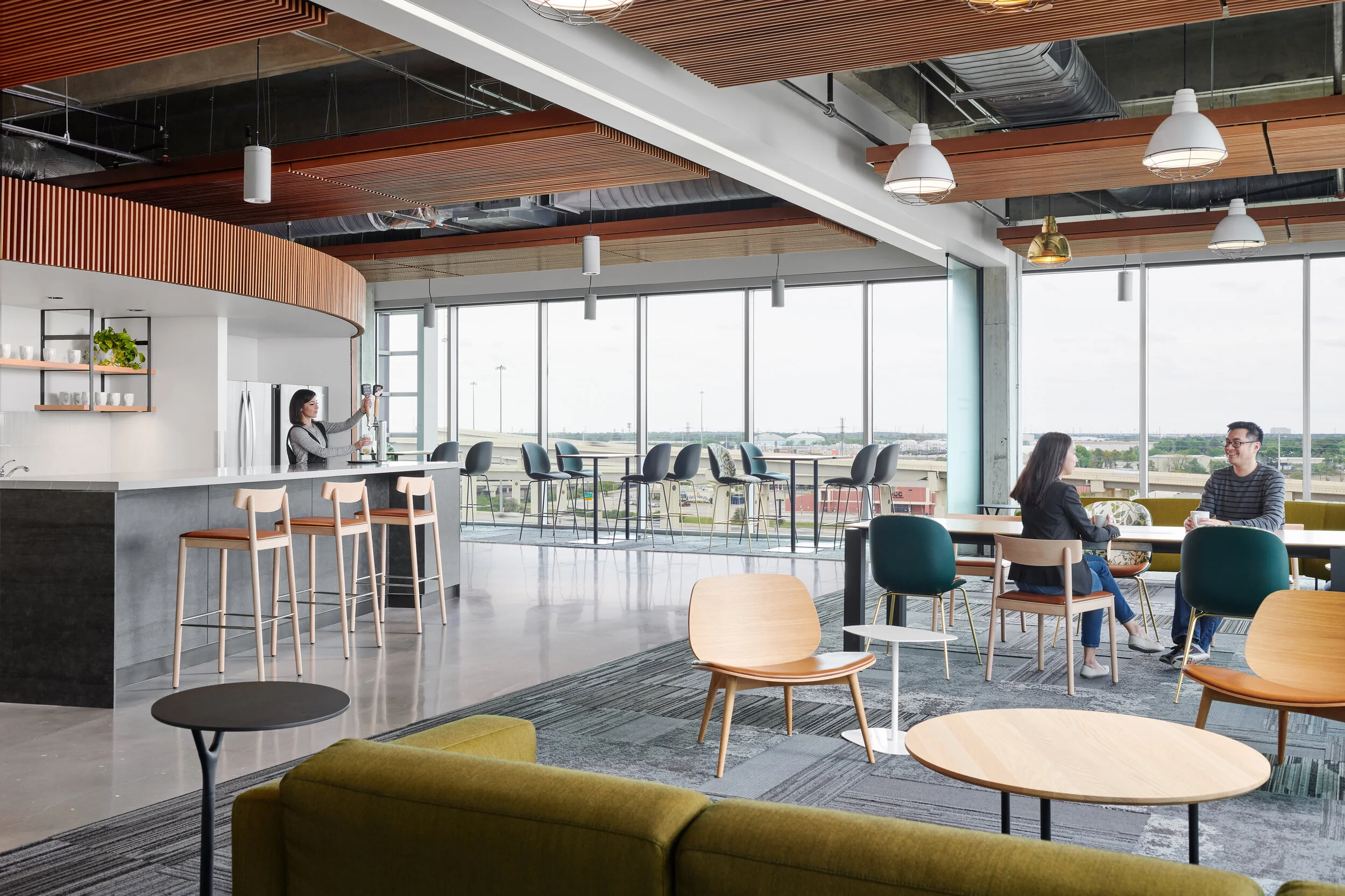
For my latest video, I returned to an earlier screen recording (partly due to some more recent screen recordings being in the wrong format) of an image we created for IA Interior Architects in 2019. This particular example helps to illustrate how Photoshop’s Pen Tool can often be the best way to create a clean transition between the exterior and interior, particularly when it comes to a large workplace interiors with a darker interior core and perimeter of floor to ceiling windows.
Making selections in Photoshop can be an incredibly powerful mechanism for isolating specific areas, whether that be to assist with color corrections, blend exposures, or incorporate models and other portions of individual frames where the lighting might not allow for simply brushing in masks. Though I employ a large variety of methods when creating selections, the one that I’ve come to lean on the most over the past several years is the Pen Tool. The pen tool, though very tedious at first, can provide the most accuracy in a relatively short amount of time once using it is mastered and becomes second nature. One great resource for learning the ins and outs of the tool is a website called The Bézier Game, which walks you through using the pen tool to create increasingly complex shapes. After honing my skills at the tool, it’s now one of my most used and is often something I reach for when beginning to create a selection of any kind.
Anyone who photograph’s spaces, particularly commercial spaces, knows that there are certain ones with the potential for great imagery, but whose challenges jump out at you from the moment you encounter them. This image is a perfect example of that. Upon entering this space which serves as a break area for a workplace, it was immediately clear to me the potential that it had - warm would ceilings with great depth and texture, a variety of great furniture that are rich in color, unique lighting design and interesting geometry. Also very apparent the moment I entered was how each of these elements along with the wall of glazing that enclosed the space on two sides created a very challenging scenario for an image that shows the entirety of the space cleanly and with the lightness that you feel when you’re inside of it.
In order to tackle the variety of challenges within the space, we had to mentally break the space up into sections in order to cleanly light the furniture and finishes to best reduce color cast and reflections from the outer perimeter. A circular polarizer was also used to create ambient frames that cut down on that reflective glare as well, knowing that all of the above frames would be combined strategically in post-production in order to create the final result seen below.

